behub

content sharing, collaborations, shared schedules: one app to bring families and friends closer

behub App

ROLE

UX Design

Visual Design

Branding & Identity

DELIVERABLES

User Research

User Surveys, User Personas, Competitive Analysis

Information Architecture

User Stories & Wireframes

User Testing 1

Wireframe Testing

User Testing 2

A/B Testing & Prototype Testing

Branding & Identity

Branding & Logo, Design Style Guide

Prototyping

Prototype & Design Brief

Outcome

Business & User Impact

SPECIFICATIONS

Duration

4 weeks

Tools & Software

Figma, Adobe Suite, Maze, Invision, Usability Hub

Team

2 Senior Designers

SUMMARY

Behub is a family-friendly app that helps to manage and organize a family’s schedule and content by collaborating among family members. The client was interested in going into the cloud storage and organizational market. We helped to identify the right target market and designed and prototyped a mobile app solution by implementing clean and fun visual elements, folders to collect and save content, message feature, and a gentle reminder.

PROBLEM

Why are parents frustrated?

The busy parents with kids have an exhausting time managing a family’s schedule and supporting each other in the most efficient way. While they communicate via email, text, or phone call, the changes they discuss are often forgotten among other things.

SOLUTION

We offer a family-friendly collaboration app that is easy and visually appealing to use even for the youngest family member. It provides a clean and easy-to-browse calendar, folders to collect and save interesting content, a message feature to communicate and collaborate instantly, and a gentle reminder to update the schedule at the preferred time: one app to bring families and friends closer.


User Research

Client's Scope

The client was interested in going into the cloud storage and organization market. They had some features in mind including saving content users find on the web, organizing that content, and uploading files. The important aspect of this product was collaboration. They believed that collaboration and social sharing features were what users would like to have. Since my client did not have a clear vision for the project or the target market, I began by user survey to test their assumptions about the user’s wants and needs.

* The survey questions were completed by over 30 people. Demographics of the responders included parents who have children, young professionals between 18-34, students, and full-time employees with different backgrounds.

Questions we asked

• Why did you start using the particular cloud storage or organizational app?

• Which features do you use primarily?

• When you use collaboration features, who do you often collaborate with?

• What kind of contents do you share and work collaboratively?

• What kind of contents do you think you want to share and work collaboratively if you do use collaborative features? (for those who are not current users of collaboration features)

Key Findings

• People who currently do not use cloud storage/organizational apps would like to share pictures and content if they feel secure about it.
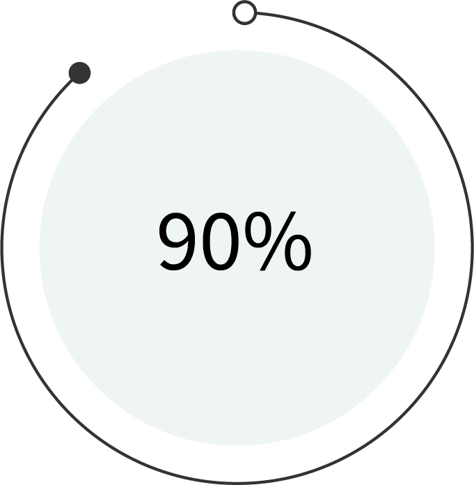
60% of parents are not satisfied with the current method of managing their family’s schedule.

Collaboration Features are used

90percent graph

WORK environment

40percent graph

among partners, friends & close people

What the users are looking for

The user survey revealed that most of the respondents use cloud storage/ organizational applications for work. This led me to explore a market for parents/families who need to manage their schedules, share content, and collaborate with each other more efficiently.

Begin with Competitive Analysis

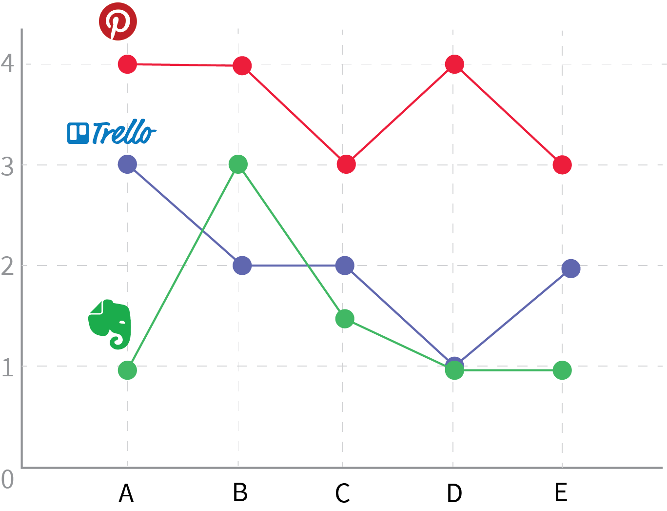
I conducted a SWOT analysis and heuristic evaluation while studying the user-flow for three competitive companies including Evernote, Pinterest, Trello.

Heuristic Evaluation

A. Visibility of system status

B. User control and freedom

C. Consistency and standards

D. Recognition rather than recall

E. Flexibility and efficiency of use

• Instructions for use of the system for Evernote are lacking and it is difficult to remember how it works especially on the mobile app.

• Trello does not support undo and redo. It leaves users with confusion and frustration.

• The system for Pinterest caters to a wide range of users, but it lacks flexibility for experienced users.
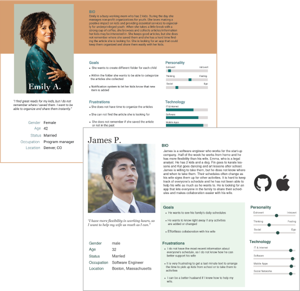
Who are our users?

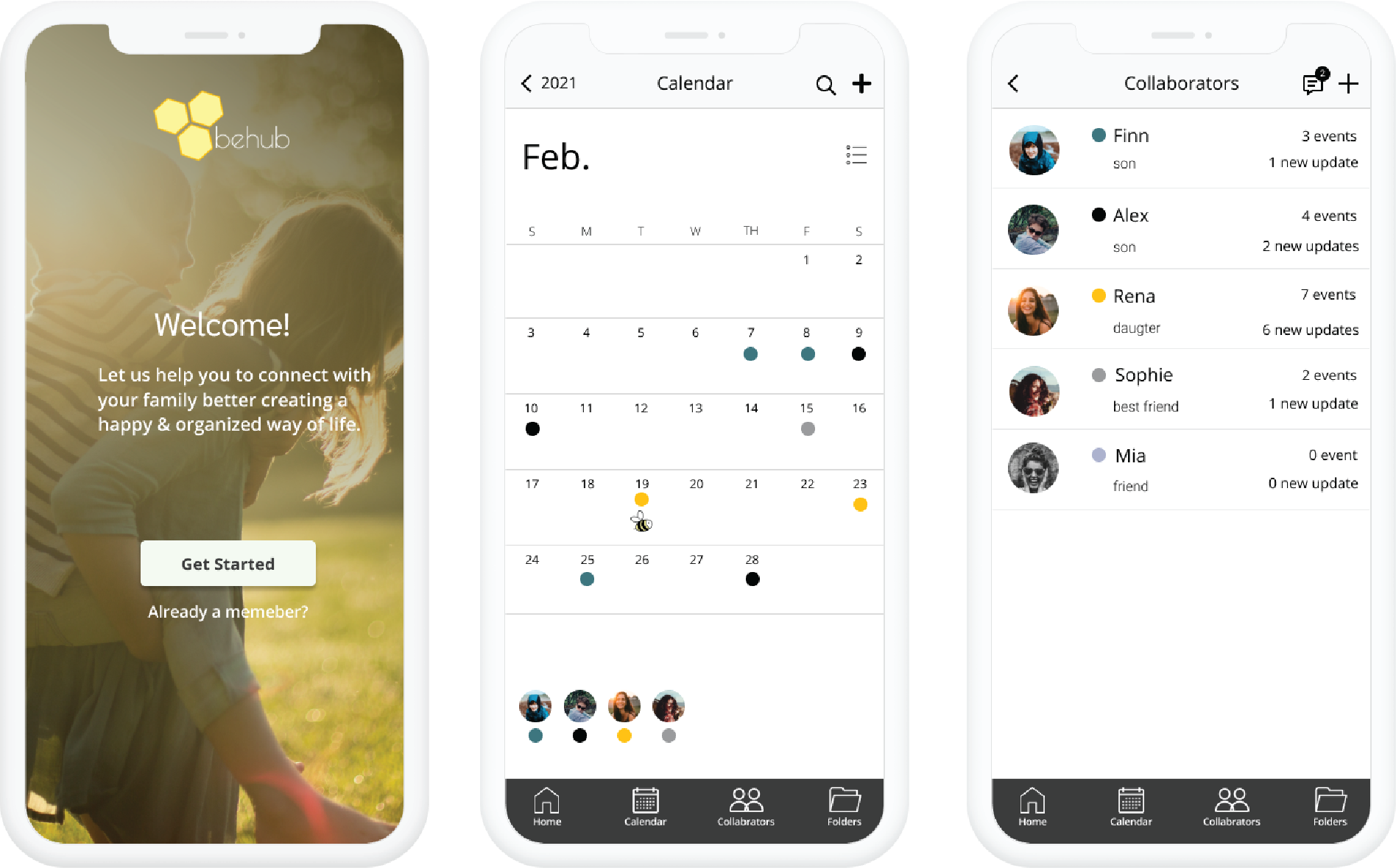
After the user survey and the competitive analysis, I found out that people use collaboration features for their work and there is a niche market for parents/families who can benefit from collaboration features for better communication and schedule and content management.

persona1

Emily

Program Manager

“I often forget to update the calendar when things change.”

Goals:

to receive an update notification in her preferred time and easy and fast fill-in options for an update

James

Software Engineer

“It takes me too long to figure out my priority tasks.”

Pain Points:

the overcrowded calendar with his work schedule and lack of visual elements to differentiate each family member’s schedule

Based on a User survey, competitive analysis, user persona, I decided to focus on designing a family-friendly application that manages the schedule and content by collaborating among a close group of people.

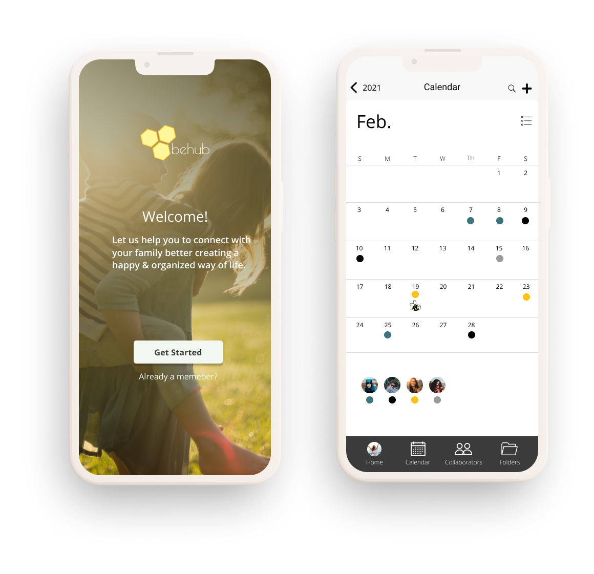
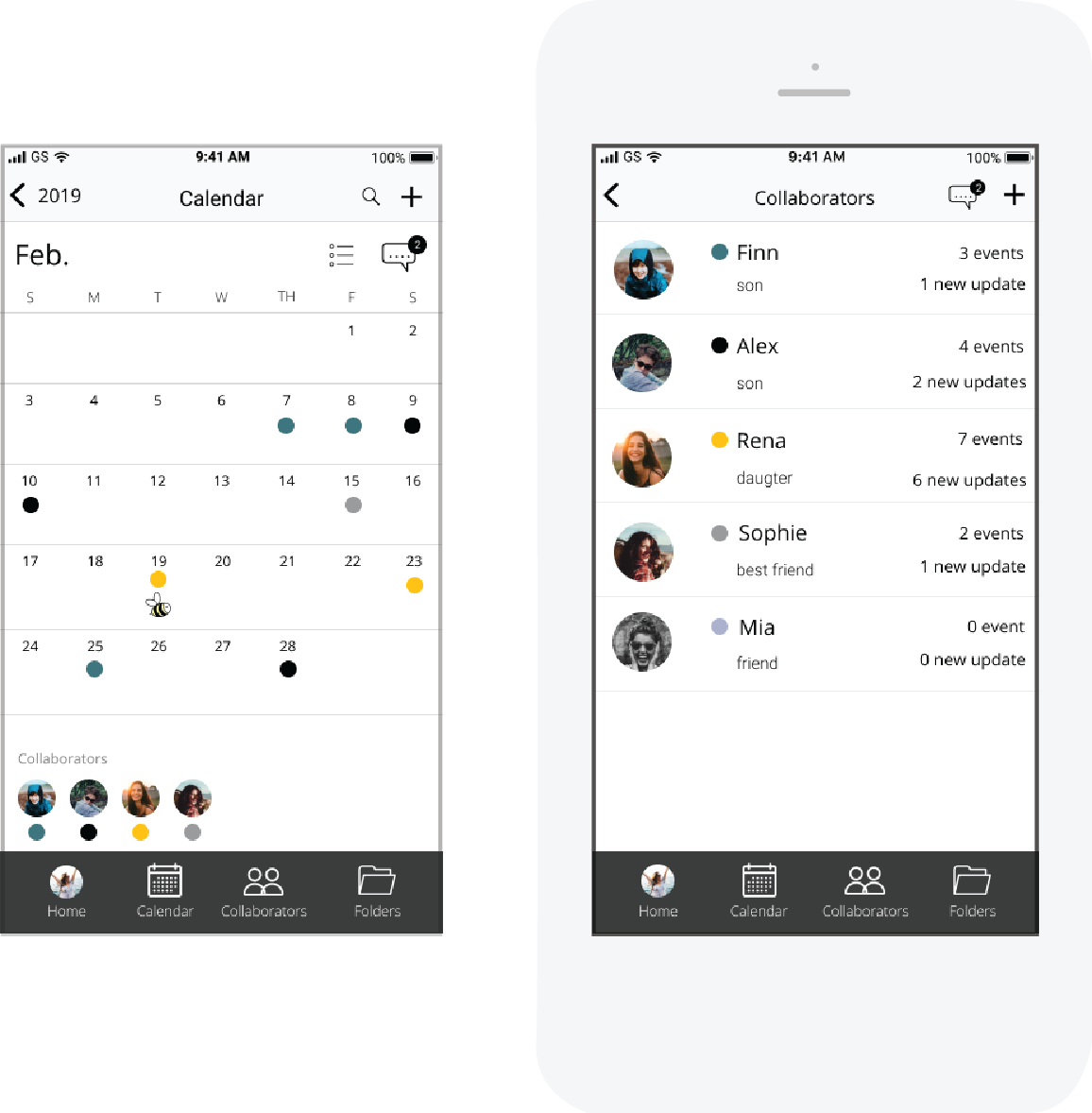
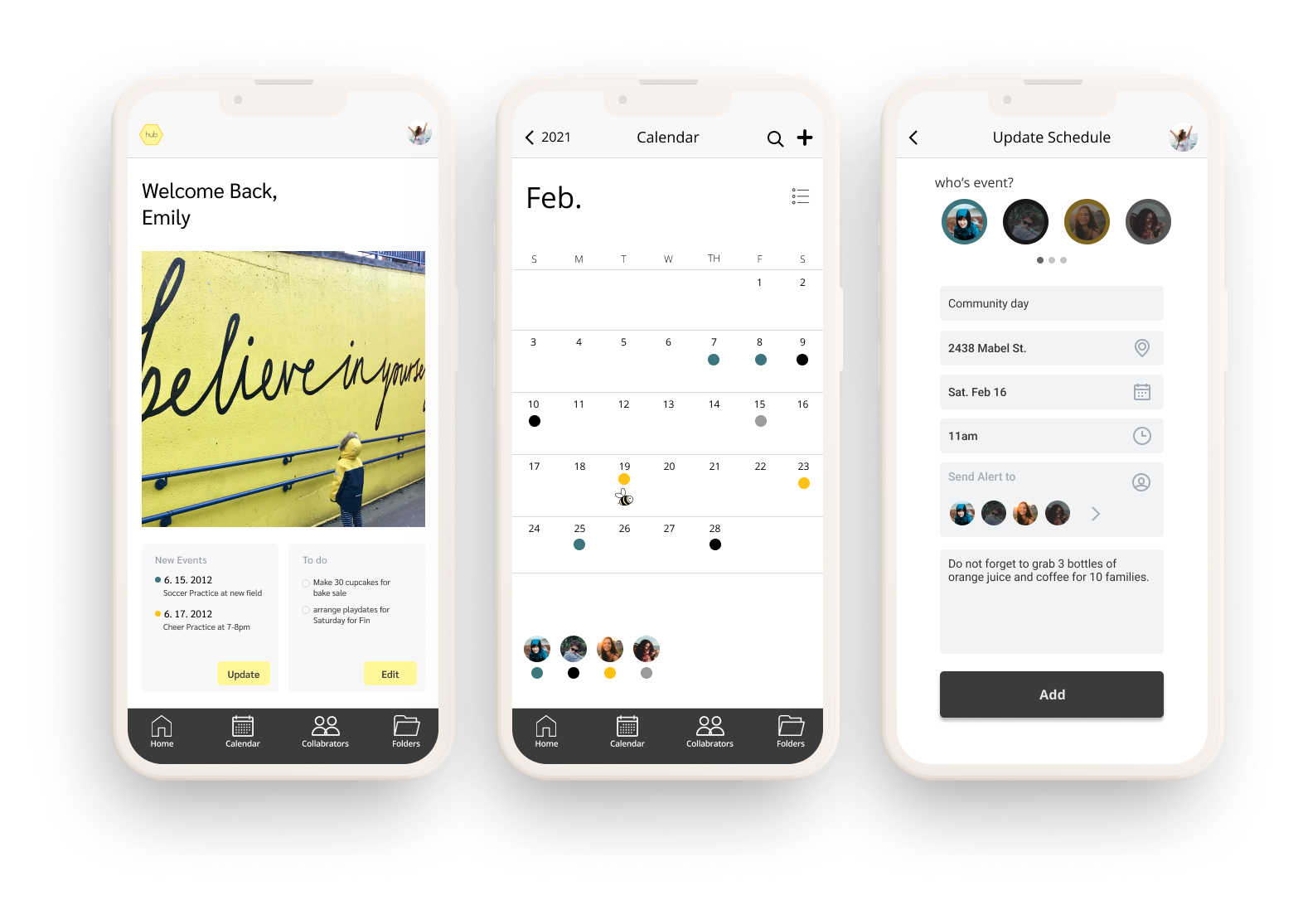
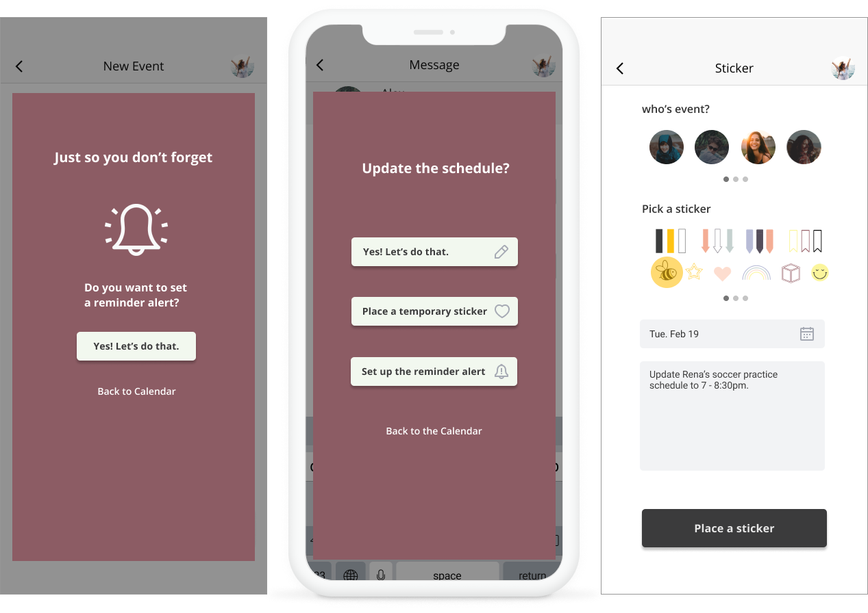
The main reason why parents were not satisfied with the current method of managing their family schedule was because they tend to forget to update the calendar when changes occur.

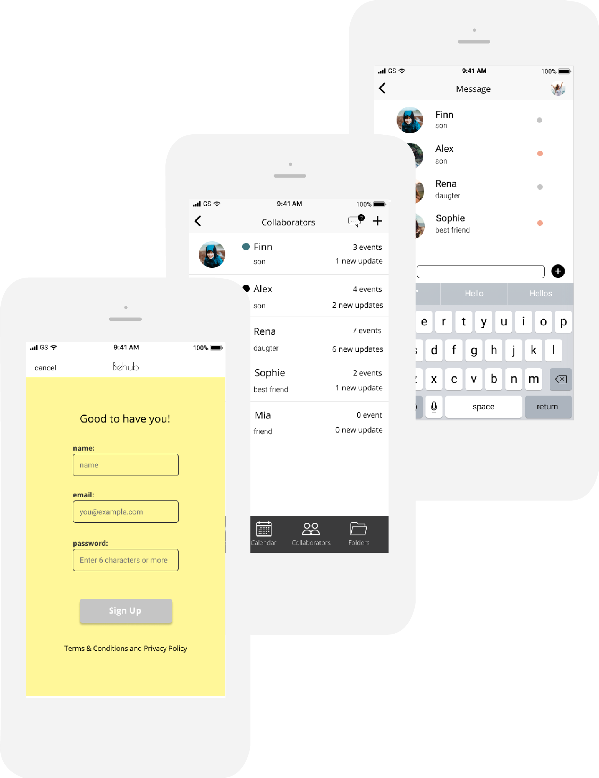
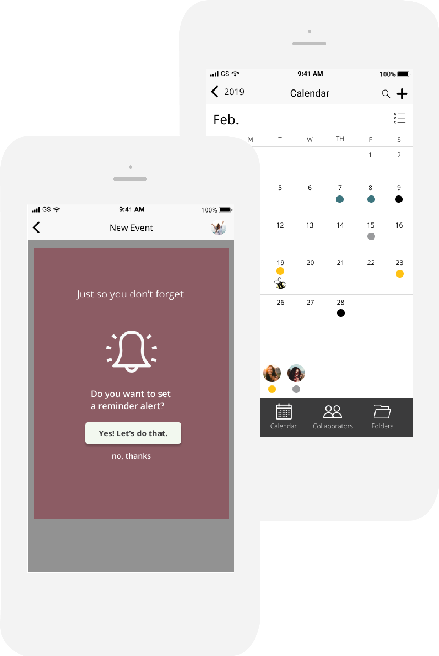
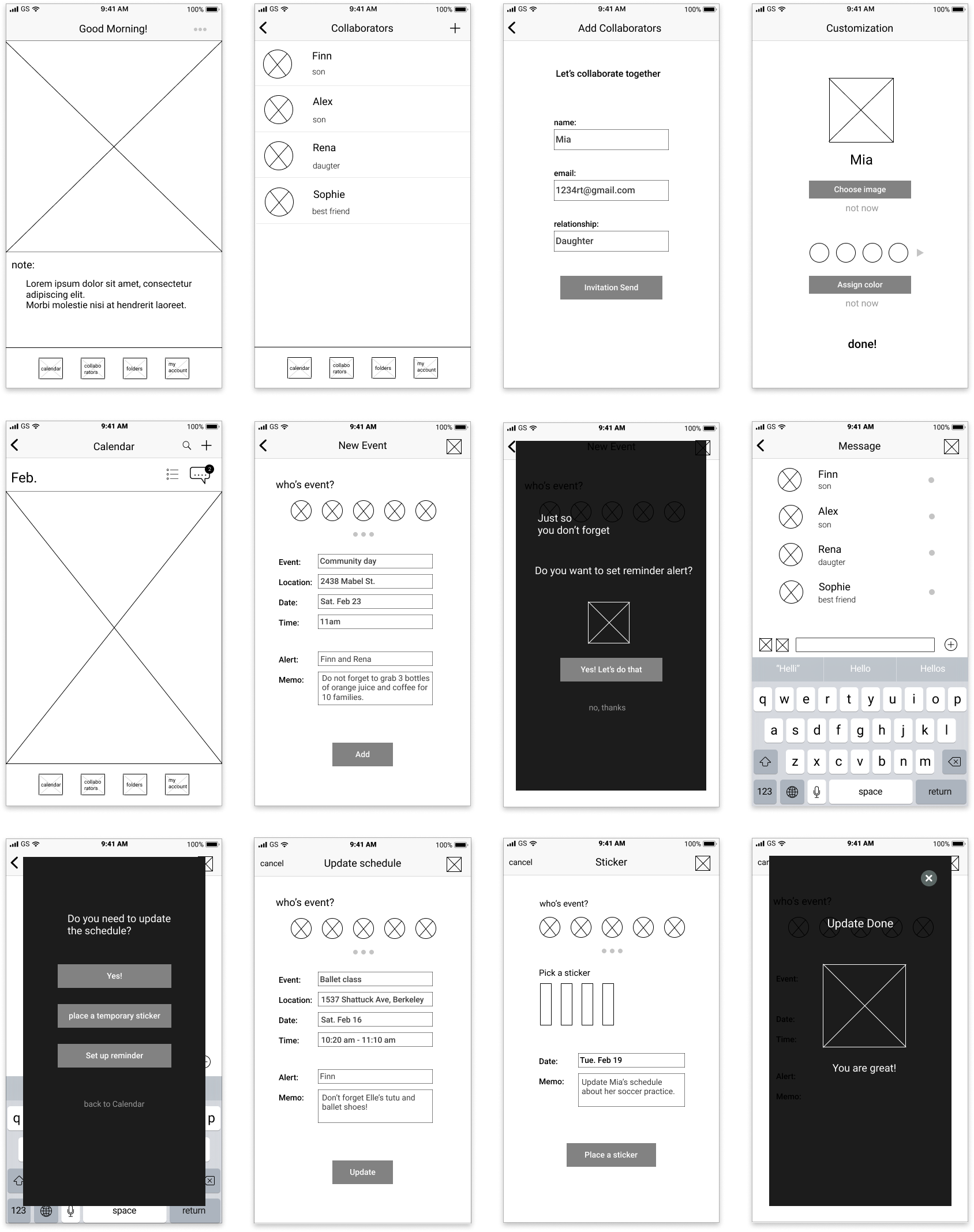
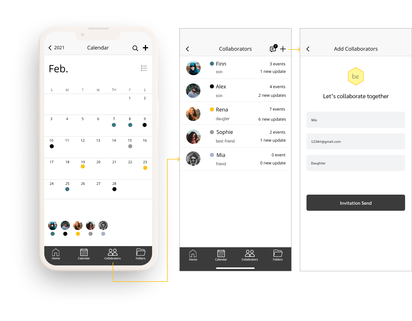
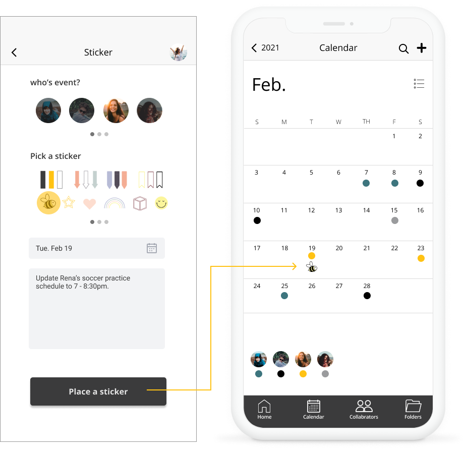
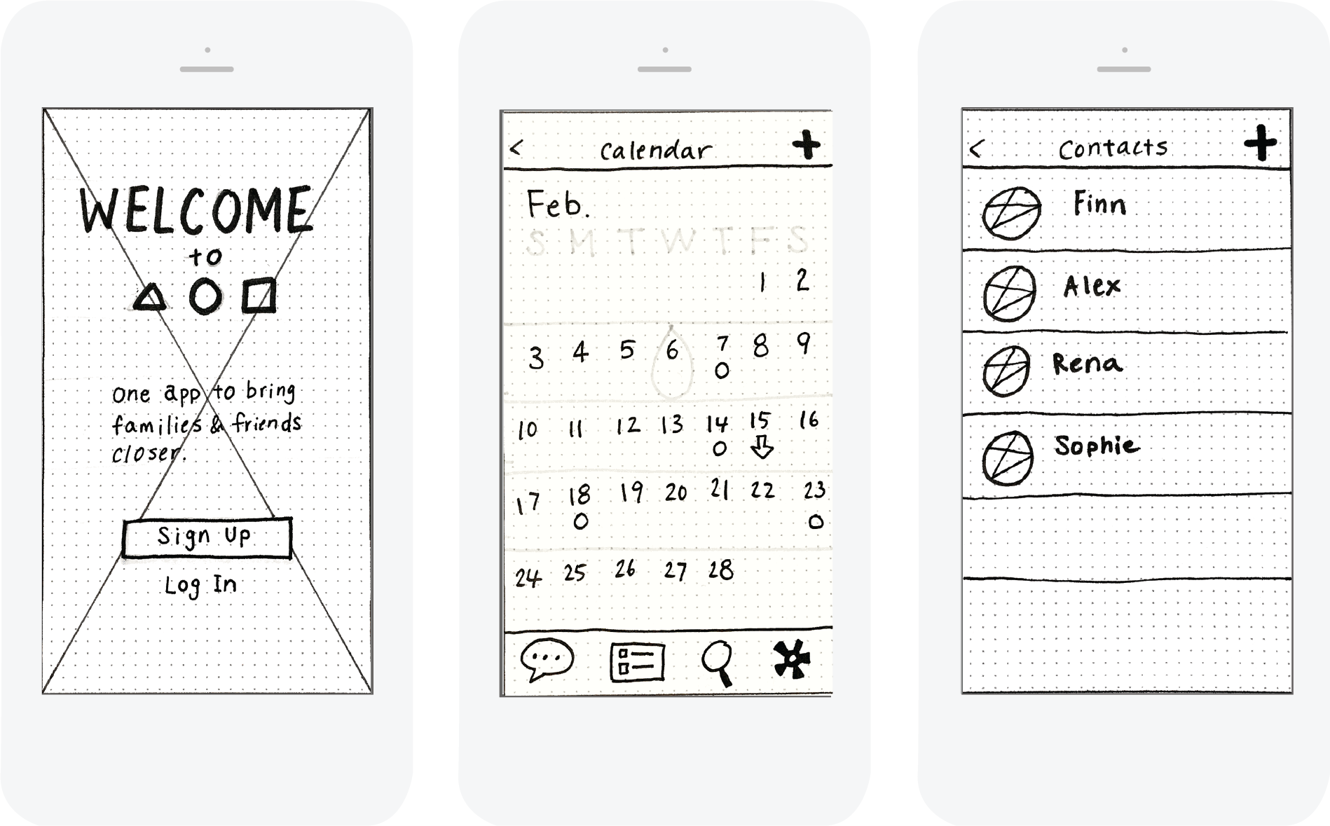
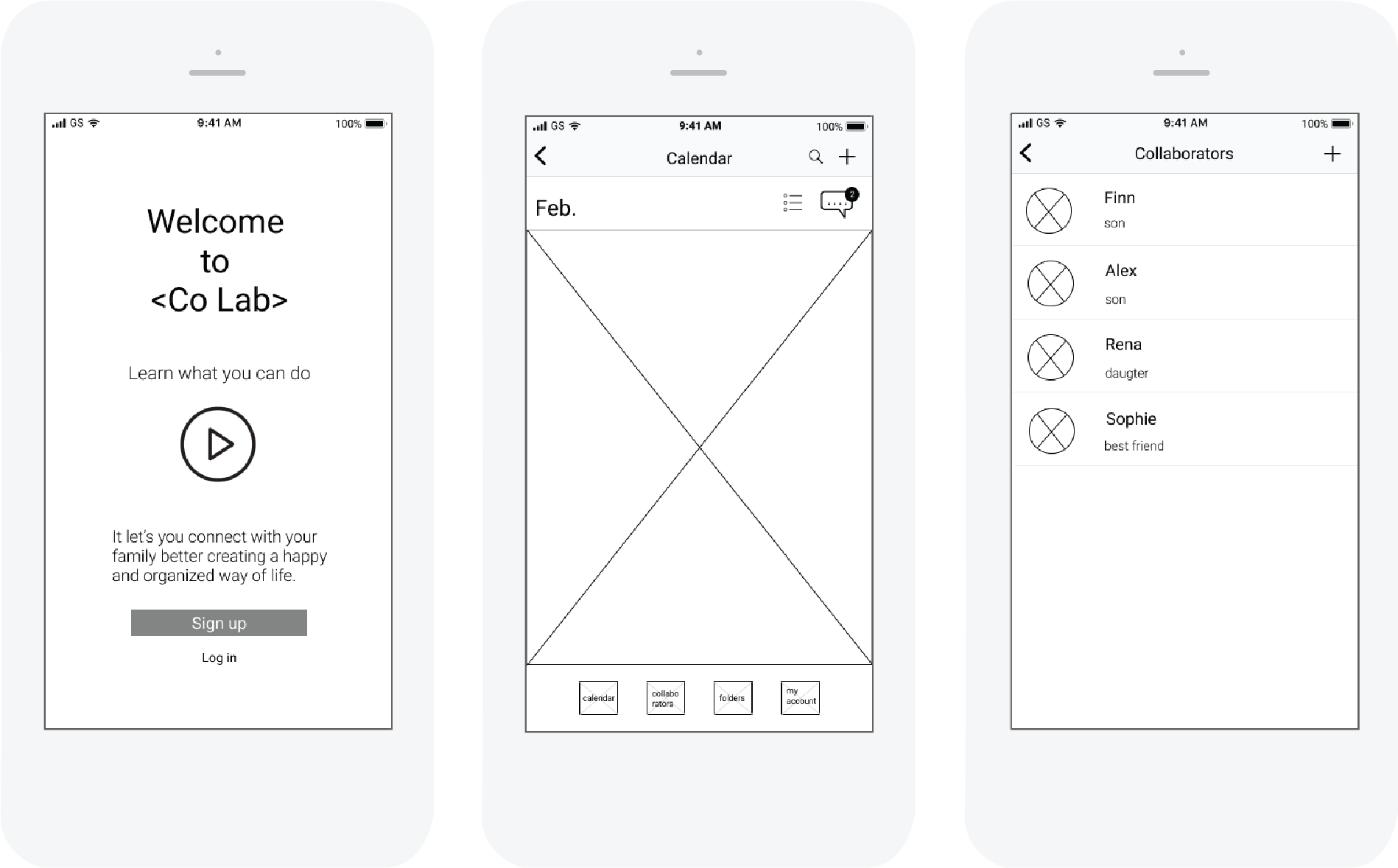
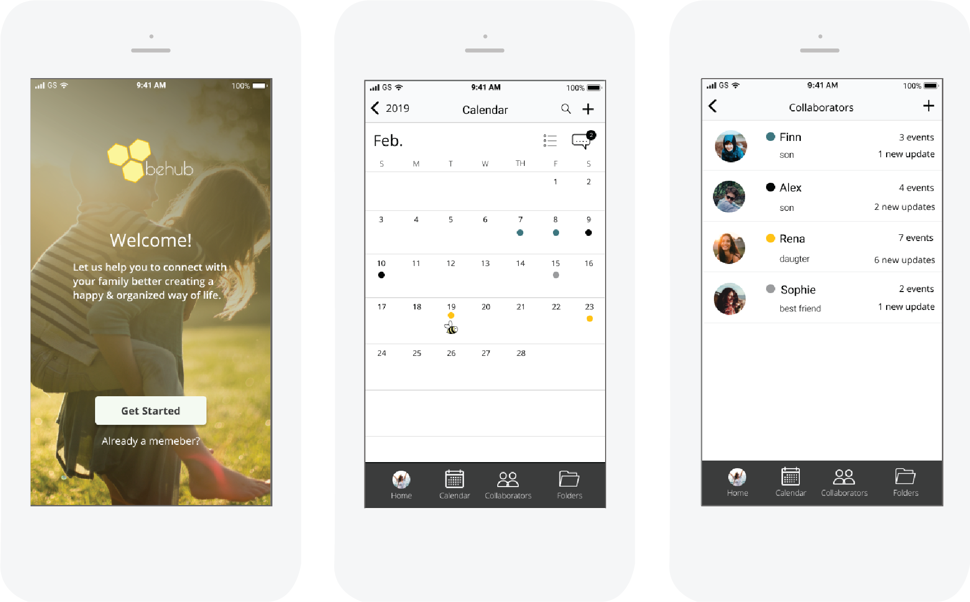
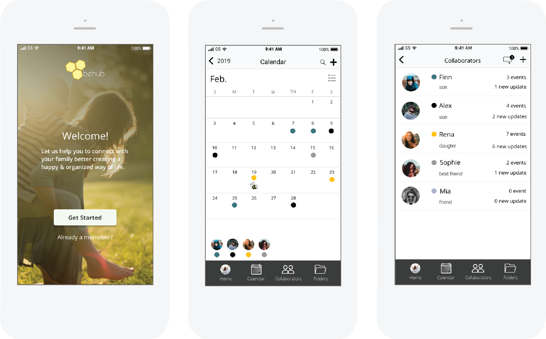
Therefore, I decided to incorporate a few different ways to make it easier for them to update their schedules painlessly. Features include gentle reminder, the update reminder, automatic update reminder after messaging, and reminder stickers to allow users to fit their needs.


INFORMATION ARCHITECTURE

User Stories

With user research in mind, I created user stories to determine the priority of the user stories as a new user, a return user, and an administrator.

As a New User

• I want to be able to sign up so that I do not have to retype everything

• I want to be able to choose who I collaborate with so that I do not share the private information with anybody else

• I want to be able to send messages in real-time so that I can coordinate the plan and add it to the calendar right away

3screens

As a Return User

• I want to receive a reminder to add any change in schedule so that I do not forget to update them.

• I want to see the calendar so that I can add/edit my family's schedules.

2screens

Wireframe Sketches

Based on the user stories, persona, and user flow, I sketched different variations of wireframes. Two key elements while designing wireframes were that all the high-priority tasks needed to be visible and accessible with ease and the easy and simple navigation that could be used even for children.

sketches
Figma wireframe
 

USER TESTING 1

Usability Testing on Wireframe

After creating the high-fidelity wireframe, I wanted to test to see how users can navigate through and complete the tasks given.

Tasks

• You found an app that lets you share your and your kids schedule with everyone in the family. How would you sign up for an account?

• You are trying to add new schedule to your calendar. How can you do that?

• You found new content on the web, you want to save it to the new group. How can you add a new group to your folder?

Based on the user feedback, I iterated a few more wireframe designs and here are 3 main improvements I made.

1. Welcome Page

Eliminated unnecessary step for users to take by creating one welcome page where users can sign up, log in, or take a tour of the main features

2. Bottom Navigation

Kept the same main bottom navigation for all the pages for consistency and smooth transition between different page

3. Remove the Dead-ends

Few screens needed to have a more obvious way for users to move on to the next screen, so I added the exit icon on the top right


USER TESTING 2

A/B Testing

After I designed the high fidelity mockups, I performed A/B test for 2 particular designs which included a welcome screen for the app and welcome page instructions with illustrations or photos.

1. Welcome Page

75% of users preferred the right design. The image and the feel resonated with testers more for the family-themed app.

2. Main Feature Visual Design

65% of users preferred the design with the photo image instead of the illustration. They liked the clean and modern look and feel of the design.

The preference test overall helped me to see the current design objectively making it easier for me to step back and understand which design was connecting better for the target users.

Usability Testing on Prototype

I conducted the usability test to examine how my prototype was working for potential users. Overall, all the 4 tasks I instructed performed well.

• To sign up

• To add a new event on the calendar with a reminder alert

• To update the schedule and place a sticker after they are done messaging

• To add a collaborator and personalize her profile

Based on the user feedback and results, I made 3 main improvements.

1. Bolder Add Icon on the calendar main page

The add icon on the calendar main page was not standing out for some users, so I decided to change it to a bolder add icon.

2. Message Feature

During the test, 70% of users had gone to the collaborator's page to find the message feature. Therefore, I decided to move it to the collaborator page where they intuitively sought it out.

3. Logo Placement

I adjusted the background image and the logo placement to create a better visual hierarchy without interfering with each other.

The clickable usability test after creating a prototype allowed me to study the user's real interactions and helped me to pinpoint the problems I could not see before. After I solved those issues, I believed the users can navigate the app easily and achieve what they want to do in a simple and intuitive manner.


BRANDING AND IDENTITY

Branding

First, I conducted branding research, brainstorming, and mind mapping. Then I created a mood board to establish the feel and direction for this project. Since I wanted this product to be clean, calm, soothing, positive, and cheerful, I collected images, words, textures that echo those values. With the branding concept, I sketched various logos and created the final logo as well as a branding and design style guide.

Why behub?

I chose to utilize the symbol of the bee which reflects the community, brightness, and personal power. The name originates from “being” yourself + the community, place where users can come and collaborate together.

View Design Style Guide
Logo sketches
Final Logo
 

VISUAL DESIGN

mock1
3 reminders screens

Smart reminders never let users forget

Update reminders and notifications would help users to update their schedule by placing a temporary sticker or setting up the reminder alert even when they are busy.

3 screens

The calendar just for families and collaborators

We believe security and privacy are so important for families, so behub offers the calendar just for people users select and no more.

fill in box page

No More Visual Clutter

We understand users have multiple children, elder members, pets, etc. To prevent visual clutter, users can pick an image and assign the color so they can identify each member across the different pages.

Fun & Engaging for all

The Sticker feature makes it practical, fun, and engaging for all the family members.

customization
 

OUTCOME

Improvements we achieved

The Behub offered families and groups of close friends the more secure way to collaborate and share information including photos, “to-do” lists, etc. The built-in integrated calendars allowed seamless and secure updates within shared groups and improved user communications.


Business impact:

The iterative prototyping and user research resulted in the fast development of the final product that increased the collaboration among family members by 30% compared to the earlier surveys.


User impact:

The interviewed users expressed more desire to use cloud platforms to manage their calendars and photos within a secure group of people that Behub has offered. 75% of the surveyed family users were satisfied with the use of shared calendar features and to-do lists.

What people say about App

I like how simple the app is. I always get overwhelmed with managing both my work and family schedules together, so this definitely helps me just focus on my family & personal life.”

-Yana M. Working Mom of 4 boys

"My 12year old daughter loves the app! She loves cute stickers she can add to the calendar instantly. It helps her to be more responsible and organized with her after-school activities."

-Mathab R. Working Mom of 12 & 4 years old

"I felt calm and peaceful even when organizing my chaotic life schedules."

-Leticia V, UX Designer

Thank you for checking out my case study. Do you have any questions?

Please get in touch, I would love to answer any of your questions 😀

Browse other projects

TONE

TONE

Providing users with a direct solution to mitigate the outburst using machine learning algorithms

STEMA

STEMA

Helping young girls to stay in the STEM field by providing a central hub