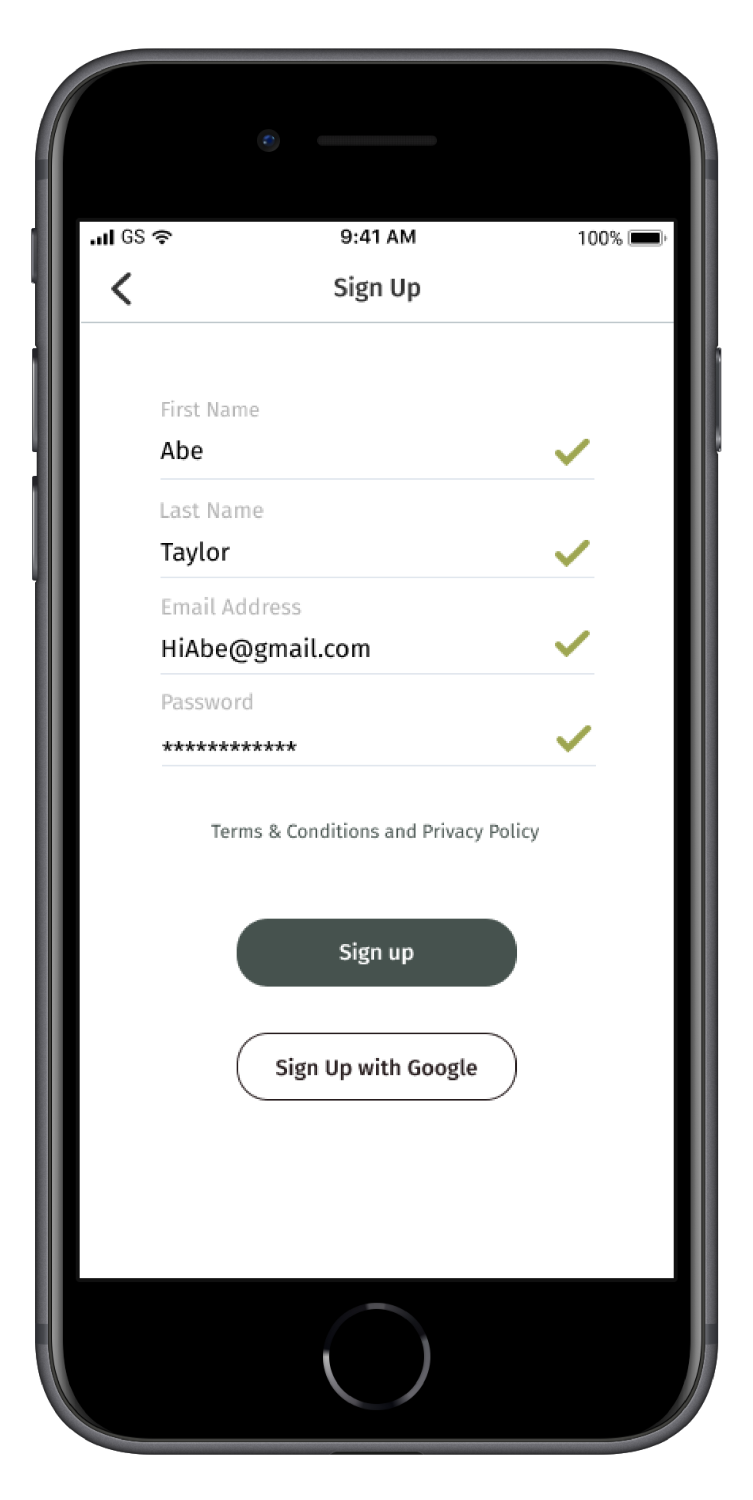
TONE

captures the voice tone using machine learning algorithms and provide users with a direct solution to mitigate the outburst caused by stress

tone App

ROLE

UX Design

Visual Design

Branding & Identity

DELIVERABLES

User Research

User Surveys, User Personas, Competitive Analysis

Information Architecture

User Stories & Wireframe Sketches

User Testing

Usability test on High Fidelity Mockups & Prototype

Branding & Identity

Branding & Logo

Prototyping

Prototype & Design Brief

Outcome

Business & User Impact

SPECIFICATIONS

Duration

3 weeks

Tools & Software

Figma, Adobe Suite, Maze, Invision, Usability Hub

Collaborators

Senior Designers

SUMMARY

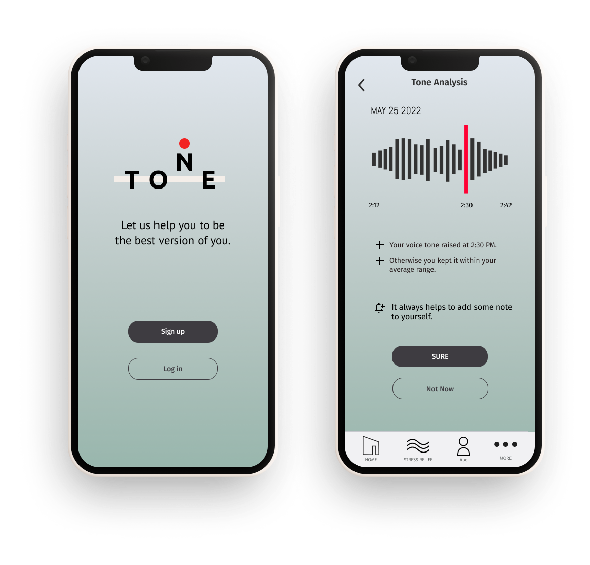
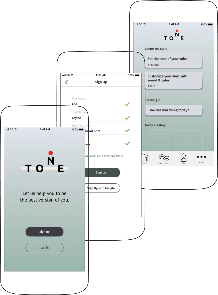
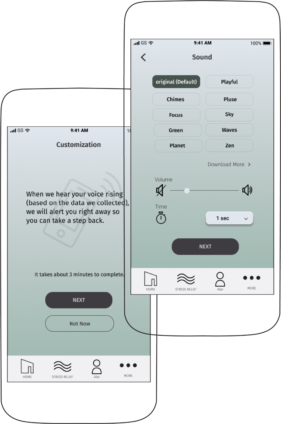
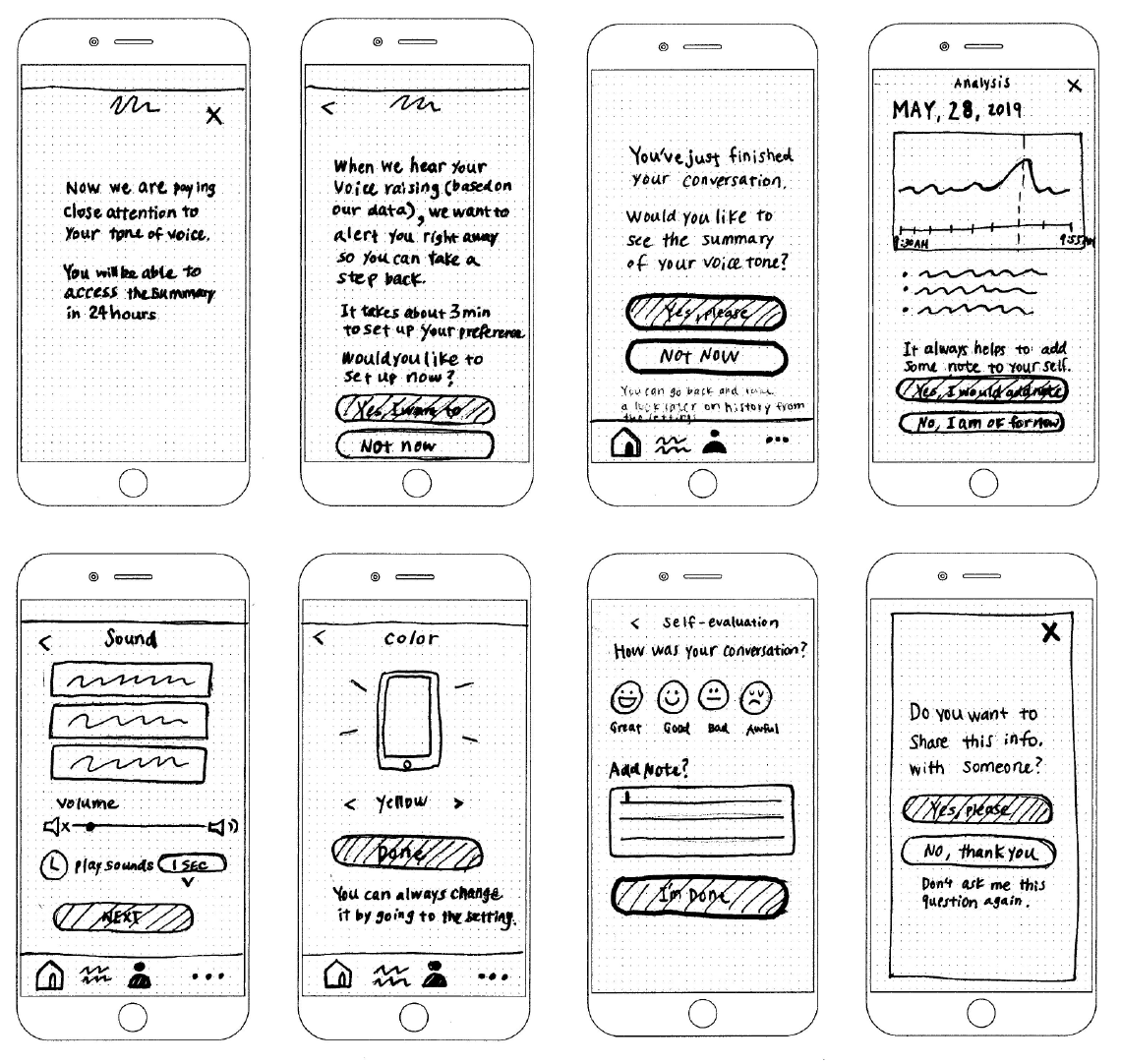
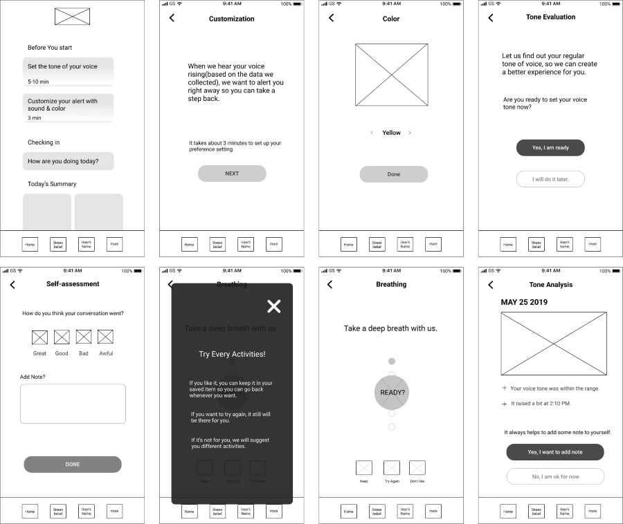
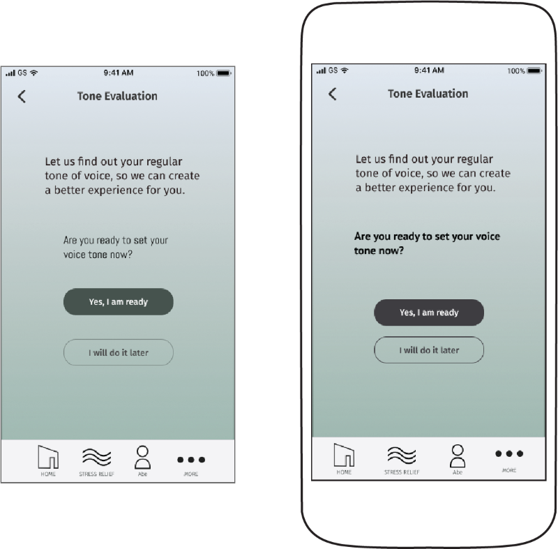
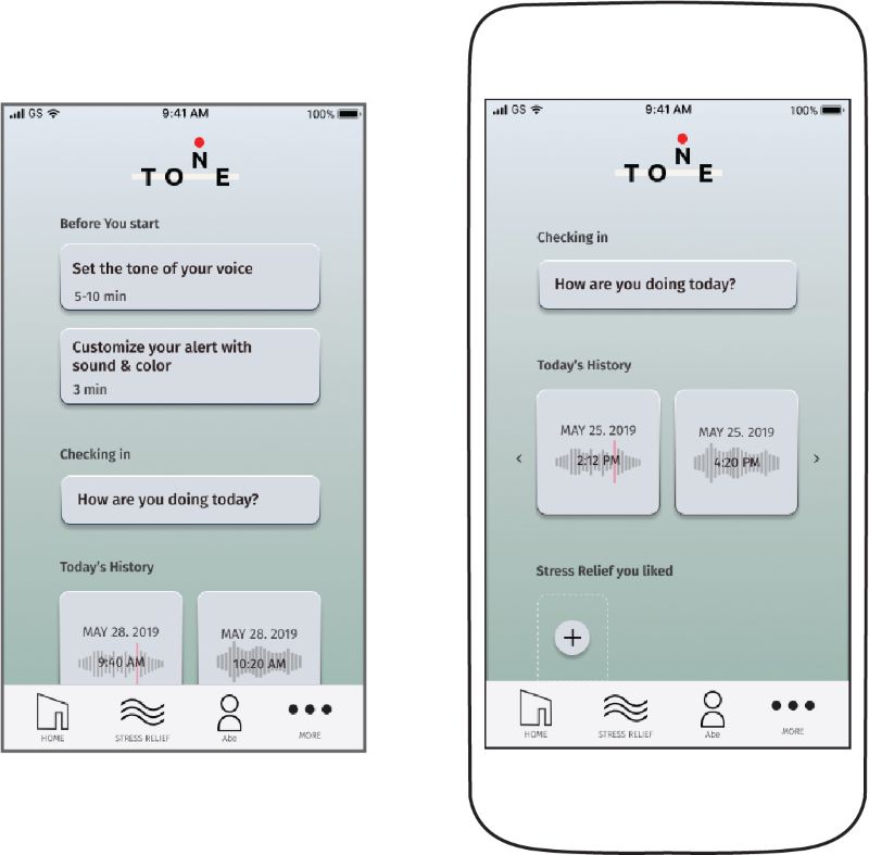
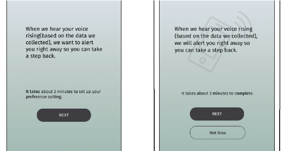
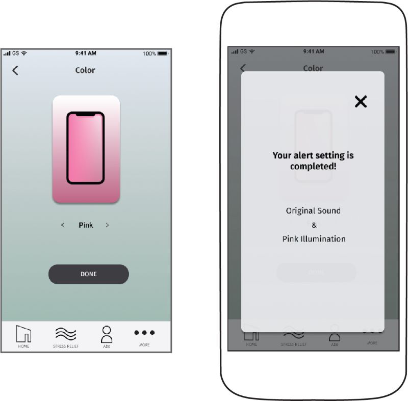
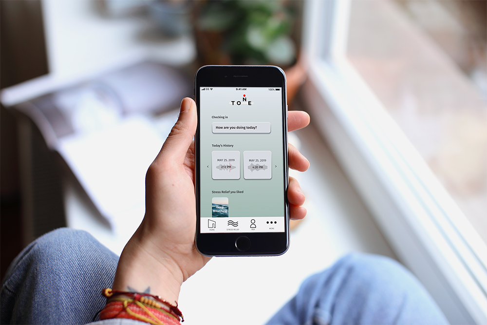
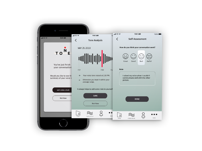
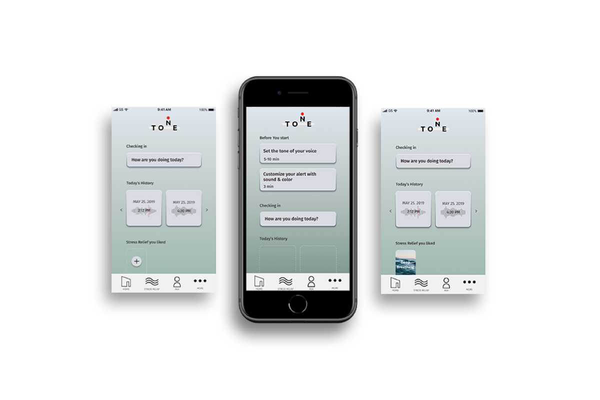
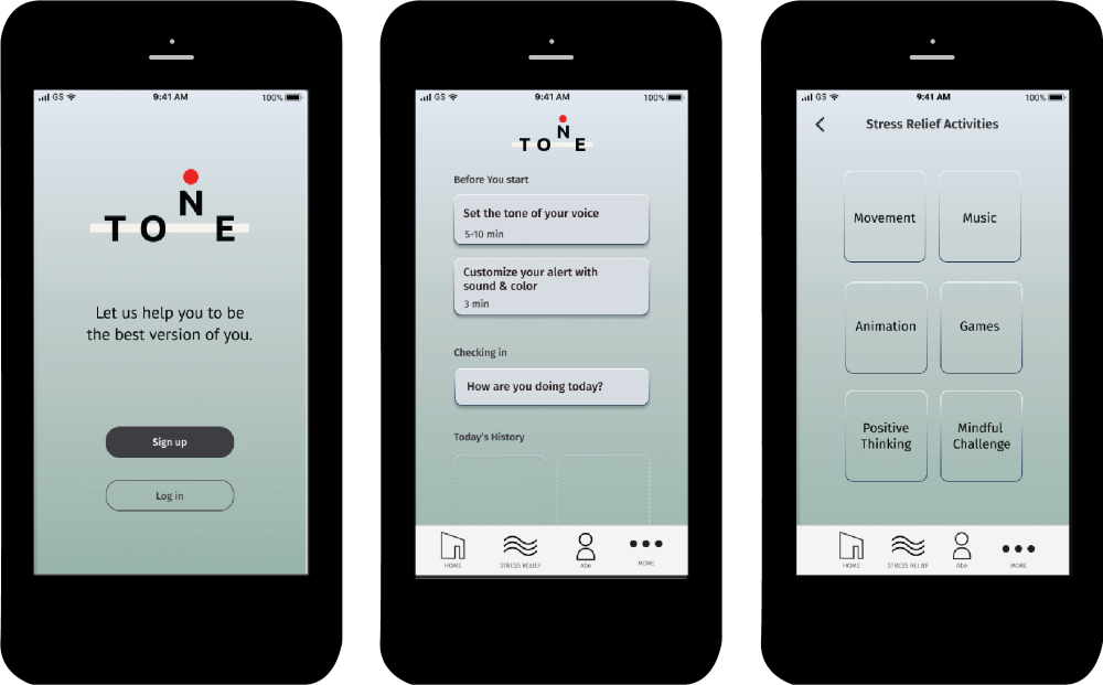
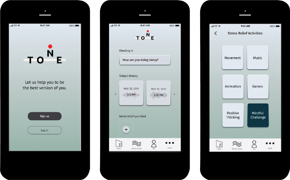
Tone is a product that captures the tone of voice using machine learning algorithms and alerts users when it rises above average to prevent them from negative consequences caused by outbursts. The goal of this project was to create a tone analysis app for the direct intervention so that users can not only get help at the right timing but also be able to reflect and improve on their stress management.

PROBLEM

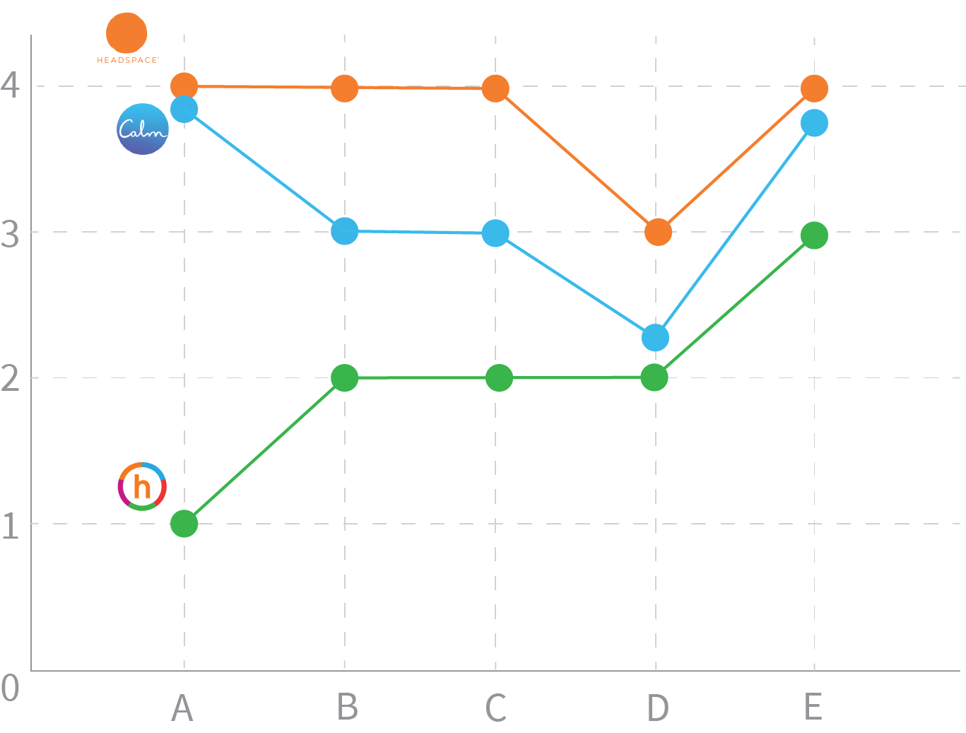
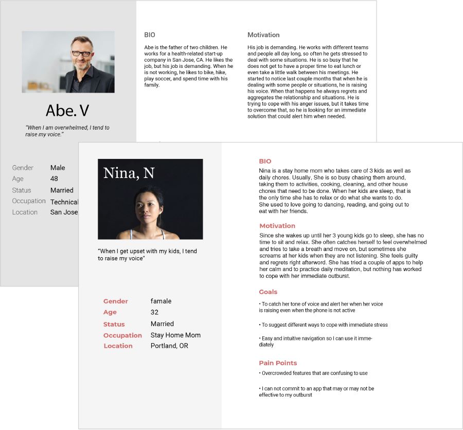
It is hard to manage the emotional responses.

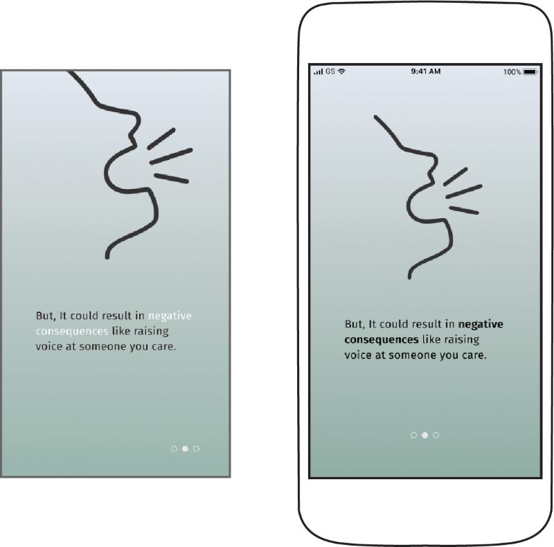
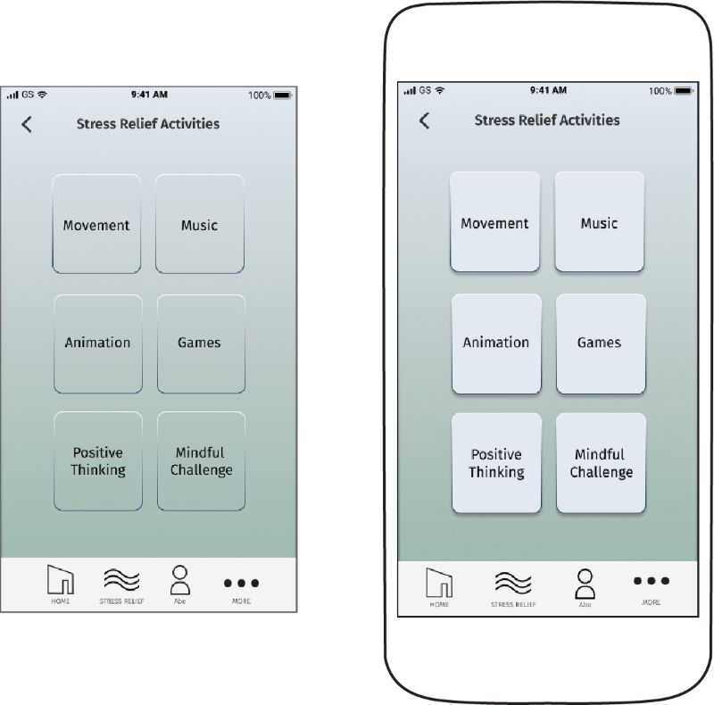
The problem is that when people are under stress, they tend to lose their temper more easily. That could lead to a negative impact on their life. While some people try to manage their stress and anger by being proactive and practicing mindful activities, it is a long-term solution and it does not necessarily prevent them from raising their voice at someone they care about.
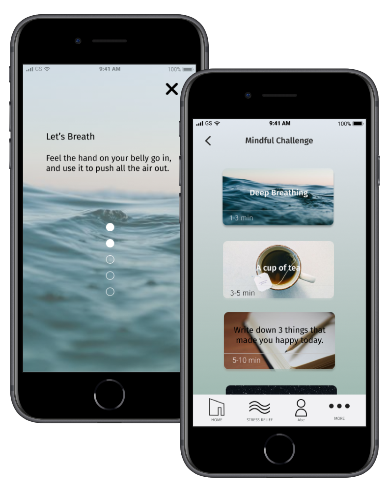
SOLUTION

How can we offer a more direct approach to outbursts?

The solution is to design a mobile app that captures the tone of the user’s voice and provide them with a direct solution to mitigate the outburst caused by stress and negative experiences in daily life.


User Research

User Survey

I started the user research by user survey to find out which methods people use to cope with immediate stress, which particular apps/products they use for stress relief, how effective they are working, the main cause of stress, and if they would like to use an app that resolves immediate stress to avoid hurting relationships or negative consequences.

* The survey questions were completed by over 30 people. Demographics of the responders included parents who have children, young professionals between 18-34, students, and full-time employees with a different background.

Survey Questions include

• How often do you feel stressed or angry?

• How do you combat your immediate stress such as when someone made you feel bad?

• How effective is the app you are using to relieve your stress?

• What kind of features would you like to see if there is an app to cope with your immediate stress?

Key Findings

76percent graph

has not found the best way to cope with immediate stress

88percent graph

never used an app to manage their stress before

83percent graph

willing to try an app to cope with immediate stress

What the users are looking for

These data revealed to me that there is a demand for an app/product that copes with people’s immediate stress by providing tangible results. Therefore, I believe an app to help users to manage their outbursts/stress by providing them with a direct solution could significantly improve their stress level.

Competitive Analysis

I conducted a SWOT analysis and heuristic evaluation while studying the user-flow for three competitive companies including Headspace, Happify, and Calm. These competitive applications aim to reduce stress, negative feelings, and sleep better by offering effective tools and guidance.

Heuristic Evaluation

A. Visibility of system status

B. User control and freedom

C. Consistency and standards

D. Recognition rather than recall

E. Flexibility and efficiency of use

Simple and Intuitive user flow: The user-flow of Headspace is simple and intuitive to use. The fun and interactive visual design encourage user engagement.

Unclear Navigation with visual cues: It is hard to navigate through the Happify’s app with overwhelming contents.

Affordability: Calm charges $69.99 for a yearly subscription before users can experiement with their app.

Who are our users?

After the user survey and the competitive analysis, I interviewed and created 2 personas who represent our target users. They are looking for a direct solution to break out from negative outbursts that continue to cause them more stress and find a way to manage it.

persona1

Abe

Technical Senior Manager

“When I am overwhelmed, I tend to raise my voice uncontrollablly.”

Goals:

to notify me right away when my voice rises and to track the trigger factors

Nina

Stay Home Mom of 3 kids

“When I raise my voice at my kids, I feel so awful. ”

Goals:

to journal the progress I make and to suggest short relaxing exercises

Pain Point:

the lengthy sign-up process

Based on a user survey, competitive analysis, user persona, I decided to design and develop a product that captures the tone of voice and alert users when it rises above average to offer a direct solution to their problems.


INFORMATION ARCHITECTURE

User Stories

With user research in mind, I created user stories to determine the priority of the user stories as a new user and a return user.

As a New User

• I want to be able to sign up so that I do not have to retype everything.

• I want to be able to sign-up before answering assessment questions so that I can answer them when I have time.

• I want to be able to navigate the app easily when I open it for the first time so that I know exactly what to do.

3screens

As a Return User

• I want it to detect and analyze the tone of my voice so that it can alert me when I started raising my voice.

• I want to be able to customize the alert so that I can recognize it right away.

• I want to have an option to see the analysis of my tone after a phone call so that I can reflect on the conversation.

2screens

Wireframe Sketches

I began sketching different variations of wireframes based on my user stories, persona, and user-flows. I made sure that all the highly ranked tasks were visible and accessible with ease. I also broke down a complex idea into a simple, guided process that allows users to navigate the app easily and intuitively.

sketches
Figma wireframe
 

User Testing

Usability Testing on High Fidelity mockups

After creating the high-fidelity mockups, I wanted to test to see how users can navigate through the app and gain any insights into its design and accessibility.

Based on the user feedback, I iterated a few more wireframe designs and here are 3 main improvements I made.

1. Onboarding-Screens

Added the top navigation bar, scaled down the image, and moved the dot navigation to the center of the screen

2. Button Design

By creating greater contrast between the background and the buttons made them more accessible to the users.

3. Call to Action

By making the call to action button more obvious, it helped users to conduct the given task.

Usability Testing on Prototype

After ideating and improving my high fidelity mockup with user feedback, I created a clickable prototype with Invision and conducted another round of usability tests in person and remotely with MAZE.

• You found an app that helps you to manage your outbursts. How do you sign up?

• You are trying to set the average tone of voice and customize the alert. How do you do that?

• You feel stressed right now. How do you try the stress relief activities and save a deep breathing exercise?

Based on the user feedback and results, I made 3 main improvements.

1. Interactive Dashboard

designed an interactive dashboard to accommodate the needs of users better so that they can access what they need instantly.

2. Main Page Design

Removed the back arrow icon and added the phone icon as a background image to differentiate from other screens.

3. Confirmation Screen

I adjusted the background image and the logo placement to create a better visual hierarchy without interfering with each other.

This usability test allowed me to observe how users interact with the product and see if its step-by-step guide helps users to navigate the product easily. Importantly, getting honest feedback from users helped me to understand how relatable the product and its visual design were.


BRANDING AND IDENTITY

Branding

First, I conducted branding research, brainstorming, and mind mapping. Then I created a mood board to establish the feel and direction for this project. Since it is a product that helps users manage their outbursts, the focus of the branding is calmness and simplicity. With the branding concept, I sketched various logos and created the final logo as well as a branding and design style guide.

Why TONE?

Our logo signifies the optimal tone of the voice with the little nudge to keep their cool and calmness using simple geometric shapes.

Logo sketches
Final Logo
 

PROTOTYPING

Prototype

The prototype demonstrates the flow of the application as well as its branding and design elements. It offers intuitive navigation with simple yet soothing design throughout the app.

View Clickable Prototype
mock1
3screens

Tone Analysis for every phone call

Tone analysis allows users to reflect on how they handle the conversation & helps them to manage their outbursts with a self-assessment feature.

3 Dashboard screens

Interactive Dashboard

Interactive Dashboard makes it easy for users to find what they need within a second.

Easy Sign up

Fast and Easy Sign Up

No need for the lengthy assessment before signing up!

We help you to manage your stress

We suggest activities that are effective to cope with user's stress. They can choose an activity depending on their time and mood. There is something for everyone.

Stress Relief Activities
 

OUTCOME

Improvements we achieved

The Tone app provides new means for people to achieve emotional maturity, which leads to a positive impact on people at work, with family, and within their community.


Business impact:

65% of the sampled user of the final prototype expressed their desire to integrate the Tone feature into communication applications such as Zoom video conferencing, which opens up-sell opportunities for the app and its further integration with APIs of other communication products


User impact:

The use of the app resulted in 85% increase in user’s awareness of the perception of their anger and its potential impact on others, based on the final prototype’s survey

What people say about App

"Simple and innovative way to keep me in check”

-Leo P, senior Technical Product Manager

“I love that I can just find a stress relief activity within the time I have.”

-Sarah. K, Working Mom

Thank you for checking out my case study. Do you have any questions?

Please get in touch, I would love to answer any of your questions 😀

Browse other projects

behub ios App

behub

Family-friendly all in one App

STEMA

STEMA

Helping young girls to stay in the STEM field by providing a central hub